How to Choose Elegant Font Pairings for Your Website with Free Canva Fonts
Here’s what you’ll learn from this blog:
Why font pairings are crucial for website design
My top font pairings available for free on Canva
How to choose fonts that match your brand
Tips for combining fonts to achieve a modern look
Resources to find even more amazing font combinations
Fonts can make or break your site’s look. Discover my favourite pairings that make any site look professional.
Designing a website can feel like putting together a complex puzzle. You’ve got your colours, your images, your content, and then there’s the fonts. Oh, the fonts! If you’re anything like me, you’ve probably spent hours scrolling through endless options, trying to find the perfect match. Fonts aren’t just about making your text readable; they’re about setting the tone and mood of your site.
The right font pairings can elevate your website from amateur to professional in an instant. So, how do you find that perfect combination? Let me share some of my secrets.
I’m Marika, the owner of Tuli Design Studio, and I’m passionate about helping businesses succeed online. Today, I’ll guide you through my favorite font pairings, all available for free on Canva. These pairings are modern, stylish, and guaranteed to give your website a polished look.

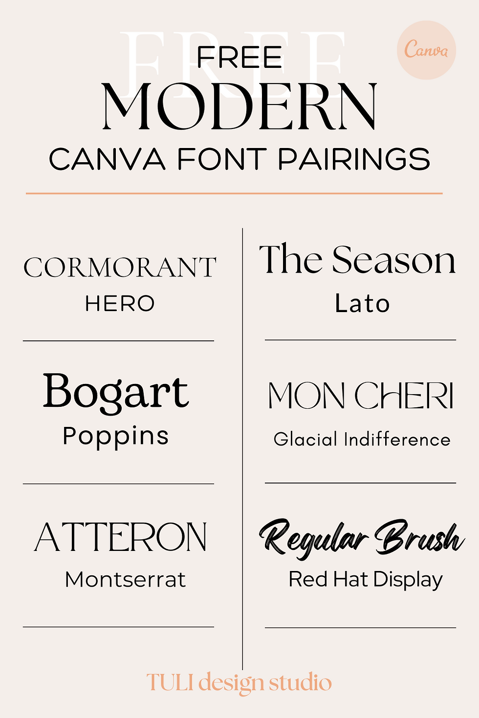
My Top Free Canva Font Pairings
Cormorant & Montserrat:
Cormorant brings a touch of elegance with its classic serif design.
Montserrat offers a clean, modern look that balances Cormorant perfectly.
Hero & Lato:
Hero is bold and attention-grabbing, perfect for headers.
Lato is smooth and versatile, ideal for body text.
The Season & Bogart:
The Season is chic and stylish, great for a sophisticated vibe.
Bogart adds a hint of playfulness, creating a delightful contrast.
Poppins & Mon Cheri:
Poppins is geometric and precise, giving a sleek look.
Mon Cheri is soft and rounded, perfect for a friendly feel.
Glacial Indifference & Regular Brush:
Glacial Indifference is minimalist and straightforward.
Regular Brush adds a handmade touch, perfect for personal branding.
Red Hat Display & Atteron:
Red Hat Display is modern and striking, excellent for headlines.
Atteron is elegant and refined, great for subtitles and secondary text.
Tips for Choosing the Right Fonts
Match Your Brand Personality: Your font should reflect your brand’s personality. Is your brand fun and quirky or serious and professional?
Ensure Readability: No matter how beautiful a font is, if it’s hard to read, it’s a no-go.
Create Contrast: Pair a bold font with a lighter one to create visual interest and hierarchy.
Limit Your Choices: Stick to two or three fonts to keep your design cohesive and uncluttered.
Selecting the right fonts can seem daunting, but with a bit of guidance, it becomes an exciting part of your design process. By using the pairings and tips I’ve shared, you can create a website that not only looks great but also communicates your brand’s message effectively.
Remember, your font choices are more than just aesthetics; they’re a crucial part of your brand identity.
If you found this guide helpful, check out more tips on our blog and see how you can further enhance your website’s design. And don’t hesitate to reach out to Tuli Design Studio for personalised help. Together, we can make your online presence shine!

.png)

Comments