Choosing the Perfect Colours for Your Homepage

Learn how to choose the right colour palette for your website
Discover the psychology behind colour in web design
Find out how to create visual harmony with colours
Get tips on using accent colours effectively
Explore tools and resources for selecting your colour scheme
When you first visit a website, what’s the one thing that grabs your attention? Often, it’s the colour scheme. Choosing the right colours for your homepage can make a big difference in how visitors perceive your site. I’m Marika, the founder of Tuli Design Studio, and I’m here to help you create a homepage that not only looks great but also feels right for your brand.
Why Colour Matters for your Website Homepage
Colours evoke emotions and can influence how people feel about your brand. For instance, blue often represents trust and professionalism, while red can evoke excitement or urgency. Understanding these colour psychology basics can help you make informed decisions about your website’s palette.
Creating a Harmonious Colour Palette
To create a harmonious colour scheme, start with a base colour that aligns with your brand’s identity. From there, choose complementary colours that enhance your base colour without overwhelming it. Tools like Adobe Color and Coloors can help you experiment with different combinations until you find the perfect match.
Using Accent Colours
Accent colours are powerful tools for drawing attention to important elements on your homepage, such as call-to-action buttons or key information. Use them sparingly to create a striking contrast without cluttering your design. Remember, less is often more when it comes to accent colours.
Practical Tips for a Stunning Homepage
Limit Your Palette: Stick to 2-3 main colours to keep your design cohesive and visually appealing.
Contrast is Key: Ensure there’s enough contrast between your text and background to enhance readability.
Consistency Matters: Use the same colours consistently across your website to create a unified look.

Tools and Resources
There are plenty of resources available to help you choose and implement a colour scheme. Some of my favourites include:
Adobe Color: Create and save custom colour palettes.
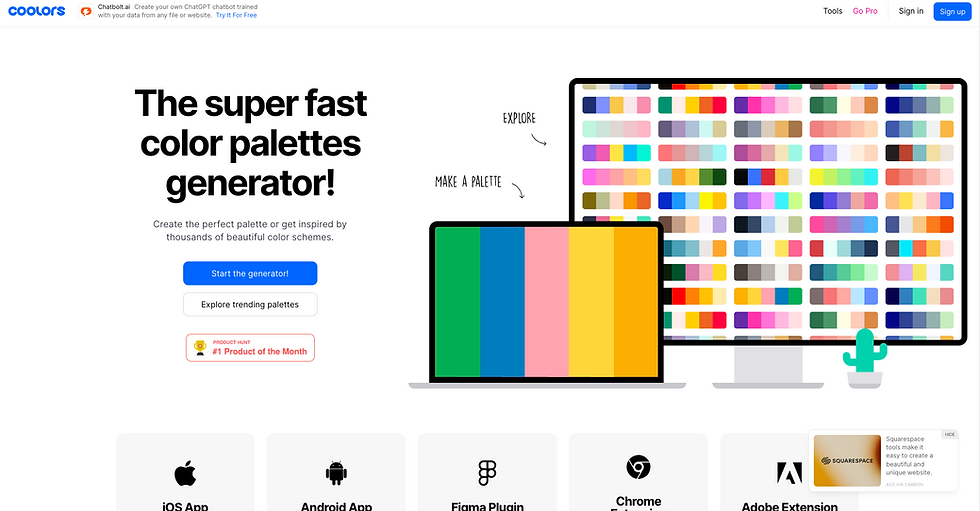
Coolors: Quickly generate colour schemes with a user-friendly interface.
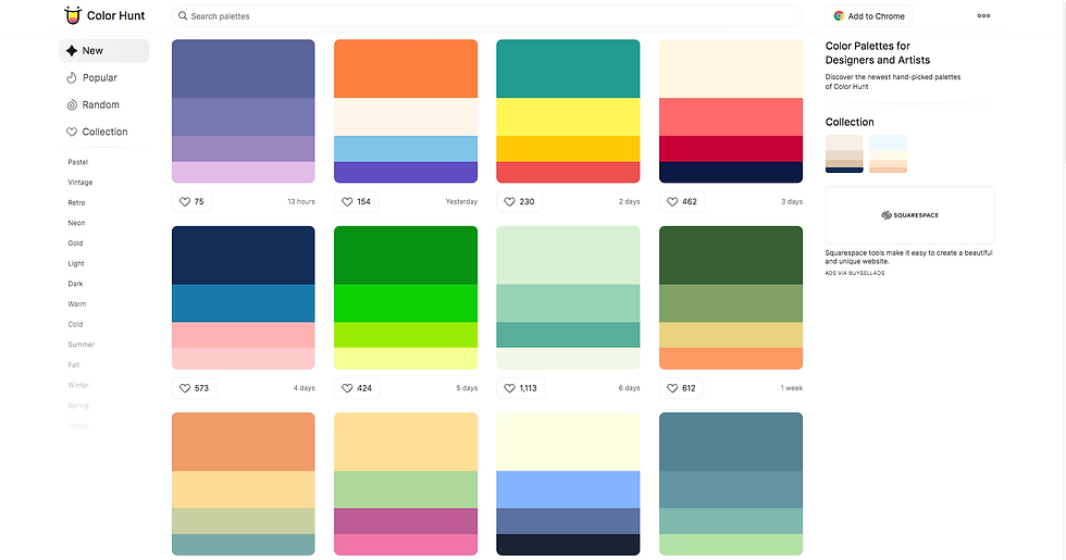
Color Hunt: Explore curated colour palettes for inspiration.
By choosing the right colours, you can create a homepage that truly stands out and leaves a lasting impression on your visitors.

Expanding Your Knowledge and Creativity
Understanding the basics is crucial, but let's take it a step further to really make your homepage pop. One advanced technique is the use of triadic colour schemes. This involves selecting three colours that are evenly spaced around the colour wheel, providing a high contrast yet harmonious look. For example, using red, blue, and yellow can create a vibrant and balanced design.
Monochromatic colour schemes can also be effective, particularly for brands that want a sleek and professional look. This involves using different shades and tints of a single colour, which can create a sophisticated and cohesive design without the risk of clashing colours.
Another aspect to consider is seasonal colour trends. Depending on the time of year, certain colours may be more appealing to your audience. For instance, incorporating pastel colours during spring or bold, warm colours in autumn can make your website feel timely and relevant.
Accessibility Considerations
Don’t forget about accessibility. Ensuring that your colour choices are inclusive can make a big difference. Use tools like Color Safe to check if your colour combinations meet accessibility standards. This is especially important for text readability, ensuring that all users, including those with visual impairments, can easily navigate your site.
Interactive Elements
Incorporate your colour scheme into interactive elements like hover effects and animations. This not only enhances the user experience but also reinforces your brand’s colour identity. For example, a subtle colour change on hover can make buttons and links more engaging and intuitive.
Conclusion
Picking the perfect colour scheme for your homepage doesn’t have to be daunting. With a little knowledge about colour psychology, some handy tools, and a bit of creativity, you can design a homepage that is visually appealing and perfectly aligned with your brand. Remember to keep it simple, use contrast effectively, and maintain consistency throughout your site. Your homepage is often the first impression visitors have of your business, so make it a great one!
For more tips on creating a clean and engaging homepage, be sure to check out our blog on Typography Tips for a Clean and Engaging Homepage Design.
If you need personalised help with your website design, feel free to reach out to us at Tuli Design Studio. I’m passionate about helping businesses succeed online and would love to assist you in making your website shine!

.png)

Comments